Vitae Rings: your life read like the rings of a tree
Cut a tree trunk and you read its story: wide years, dry years, healed scars. Vitae Rings brings that reading to a human life. Each ring is a year, each sector a month, and the thickness of the stroke tells how eventful the period was.
Free, no credit card required.
What is Vitae Rings?
Vitae Rings is a VitaeMap display mode that draws a journey as concentric rings. The innermost ring is the first year of the map, each following ring the next year. A full turn represents twelve months: January at the top, then clockwise. Every coloured cell is a month (or quarter, or half-year) containing at least one event, and a click opens the event detail.
How to read a Vitae Rings chart
One ring = one year
Years run from the centre outwards. You instantly see the time span covered and the rhythm of full and quiet periods.
One sector = one period
The circle is split into months, quarters or half-years depending on the granularity you pick. January starts at the top, the vertical axis acts as the anchor.
Thickness = density
In density mode, a sector is drawn at 1/3, 2/3 or full thickness based on its event count compared with the busiest period of the map. Intense years jump out.
Colour = meaning
Colour by category, by tag, or — for premium accounts — by indicator (impact, satisfaction, emotional intensity, level) using a colour-blind friendly gradient.
Set it up in a few clicks
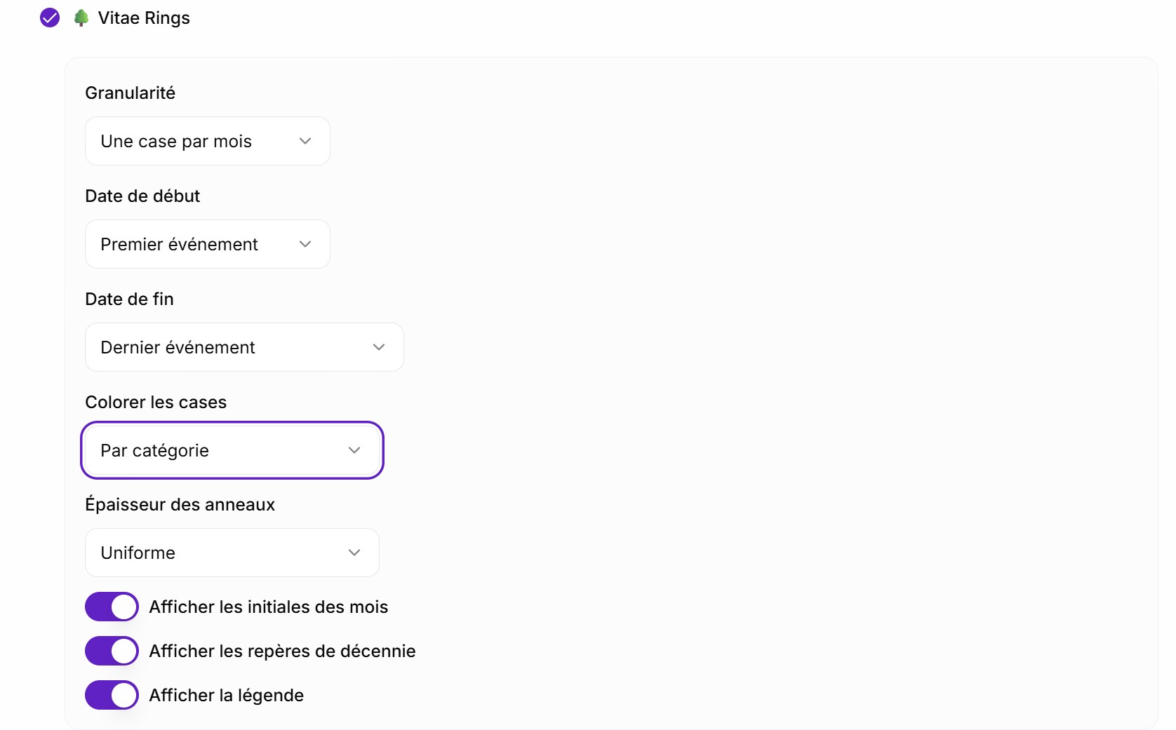
Vitae Rings is configured from your VitaeMap editor, in the Display modes tab.
Granularity and time span
You can define if you want a weekly or monthly view and also the timeframe of the representation. You choose when your Growth rings start and when it ends.
Create a VitaeMap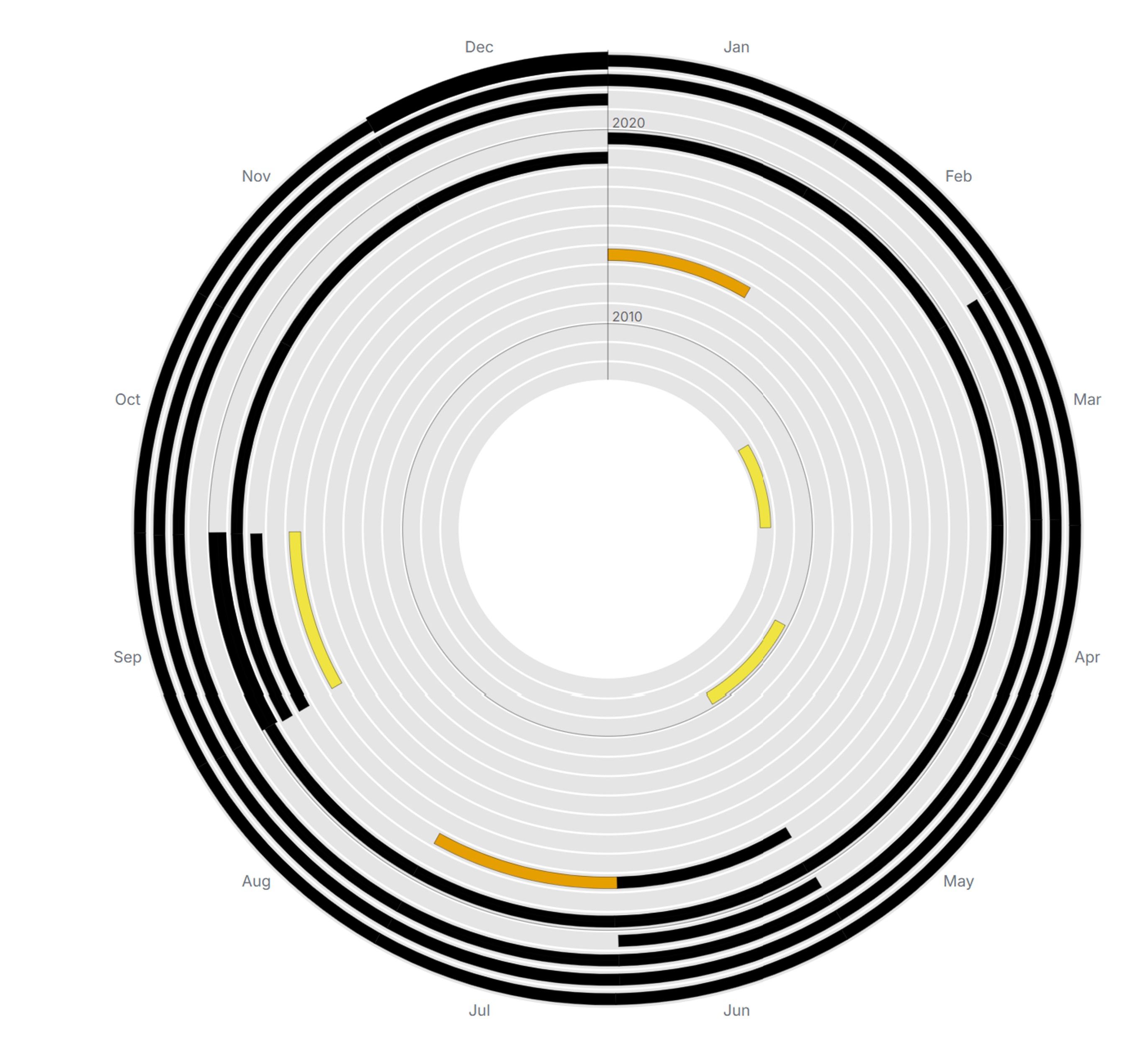
Colour and thickness
There are multiple options for the Vitae Rings to stress out what really matters for you. For example, you can decide if the color is related to the category of events or of the personnalised tags. If you are a premium user, you can even see how an indicator evolve all over your VitaeMap. Moreover, you can define if you want that the thickness of the arcs are linked to number of events during this time frame.
Why this visualization is different
An instantly readable metaphor
Nobody needs a manual: tree rings speak to everyone. Vitae Rings turns a personal database into an object you grasp in three seconds.
Cycles become visible
Always-busy back-to-school months, empty summers, pivotal years: what a linear timeline dilutes, a circular reading aligns. The same month always sits at the same angle, year after year.
A whole life on one screen
Forty or eighty years fit inside one circle, no scrolling. Where a timeline forces you to scroll, the rings show everything at once.
Interpolation for quiet periods
With indicator colouring you can smooth the colour of event-free periods to get a continuous heat map of your journey instead of a mosaic full of holes.
Frequently asked questions
Is Vitae Rings premium only?
No. The mode is available to everyone. Only indicator-based gradient colouring and interpolation of event-free periods require a premium account.
What happens with an event spanning several months?
It colours every sector it crosses, including across several rings when the event spans multiple years.
Can I show a life starting before my first dated entry?
Yes: you can manually set the start date (your birth, for instance) and the end date of the rings in the mode settings.
How is it different from the Life Grid?
The Life Grid splits time into rectangular cells (weeks or months) laid out in rows: great for counting. Vitae Rings uses a circular reading: great for spotting seasonal cycles, and for the beauty of the result.
Read next
Draw your own rings
Add your events, switch on Vitae Rings and watch your journey take the shape of a tree trunk.